The Equalizer


When you perform a typical search on JSTOR, you often get a lot of results. A search for the “commerce clause,” for example, will get you 60,000 results, which is too many to go through individually. Still, with some search term kung-fu, you can ensure that the top results returned are the ones you really care about. When we we were building the Understanding the US Constitution app, however, we realized that this paradigm doesn’t quite work. The long list of articles would be every article that quotes or mentions the Commerce Clause of the Constitution; they can’t be sorted by similarity to search terms because there are none. Our mission: We had to find another way to sort or filter results, and it needed to be easily done on a smartphone.
For more than a year, we’d been mulling over a search results idea we’d been calling “the Equalizer” and looking for an opportunity to use it. We wondered, Was this our chance? The concept was a sort or filter based on the ability to say “I want more of this and less of that.” Let’s say, for example, that you’re researching the 5th Amendment. You could get every article that quotes it, then use the Equalizer to specify that you want more articles about interrogations and cross examination and fewer articles about acquittals and attorney-client privilege.
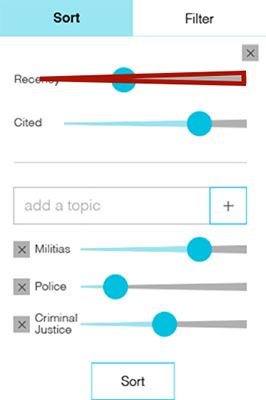
The Equalizer we had in mind was controlled by sliders. Sliders are an easily understandable and directly manipulatable UI control for touchscreens. When we showed it to potential users of the app, they seemed excited about the concept. The first version of the app had an equalizer that looked like the image on the left.
We wanted to to use the design on the right instead, since the shape of the slider bars adds another cue to their purpose, but it wasn’t technically feasible within the Ionic framework we used for development.

We tested it with university students at a coffee shop in Ann Arbor, MI and with historians at the 2016 American Historical Association conference. Both groups liked the app and how easy it was to get articles related to a particular part of the constitution. They were excited about the Equalizer… once we explained it to them. Uh-oh! Unfortunately, it was nigh impossible for someone to figure out what the Equalizer was for and what it did from looking at it. One person wouldn’t even dare to venture a guess. Back to the drawing board!
The first step was to eliminate the tabbed distinction between sorting and filtering. Strictly speaking, the Equalizer sorts results, but with thousands of results, a sort might as well be a filter. No one is checking out result #4,617.
As a team, we brainstormed six alternative ways to present the Equalizer, focusing on making it clear and intuitive without tabs and with only minimal distinctions between sorting and filtering. Because we had so many ideas, we got some quick feedback on them via a Question Test on Usability Hub to weed out the ones that were least clear. We showed the images below to 84 people – 14 people for each of the 6 designs - with the question “What would happen if you moved the slider[/item/toggle] up for “Social Philosophy”?
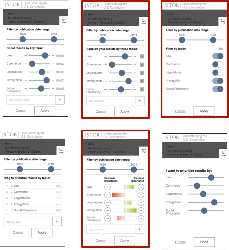
The test gave us superficial answers that didn’t dive deep into users’ understanding of the Equalizer, but that’s all we needed; it was enough to rule out three of the designs as being unclear. The “winners” have red borders, above.
Now with only three options to choose between (or mashup), we headed back to the coffee shop to talk to more students. We talked to 7 people, and at first we weren’t recognizing any trends. Then, we had a revelation. We’d been showing the three options in a random order, for good experimental protocol. They always understood the third one best! It was a matter of cumulative understanding: vaguely understanding the first design, making more sense of the second, then everything “clicking” by the time they saw the third design. To avoid that bias, we tried something unorthodox and started showing them all three at the same time. Then, some patterns started to emerge.
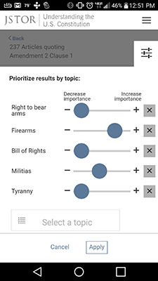
We considered many labels, and evolved the design further with more rounds of user testing. Finally, we came up with a successful “Prioritize results by topic” message (note that “Prioritize” sidesteps the whole sort vs. filter issue), and we added smaller notes pointing out that the sliders increase and decrease relative importance.
Our path to refining the Equalizer was an instance of a powerful interaction concept that proved difficult to present intuitively. It took us many iterations to get to something that worked well. Since the last post about Understanding the US Constitution, Android version of the app has been released. Analytics tell us that about one out of every six uses of the app includes moving sliders on the Equalizer. Considering that this is a completely new way of manipulating a search results list (at least, we couldn’t find anyone else who had done this!), that’s not half bad!