JSTOR Snap


As described in the previous post, the JSTOR Labs team held another weeklong flash build in December. When we talked to students and faculty who use JSTOR and similar products for research on Monday of that week, they had no desire to use a phone to conduct a search for academic literature. Knowing that their concerns may have been based on how thingsare instead of how they could be, we persisted.
Later in the week, we zeroed in on a search that allowed researchers to take a photo of a page of text with their smartphone camera. The photo is run through OCR and the resulting text has topic modeling applied and then the app presents articles from JSTOR about the same topic. The photo-as-search concept was well received, but users were still unsure that the search results could be made manageable on a smartphone.
One of the biggest challenges we faced was displaying search results on a tiny screen. For each article in the list, users wanted to see display title, author(s), journal, year, as well as a way to save it to a list. They also said that keywords and abstracts are extraordinarily helpful in quickly gauging the value of an article. That"s a lot to try to fit in even on a large screen, and phone screens, while growing, aren"t large!
We mocked up two fundamental ways to show results. First, we had a more-typical "list-view:" that is, the results arranged vertically in a scrolling, numbered list (the first two phones below show variations on this first approach). Second, we experimented with displaying one result at a time. That gave us a reasonable amount of space in which display all the necessary information about an article – in some cases even more than is usually seen in search results – while also working with a phone-friendly swipe-motion to navigate through the results. It also, unfortunately, meant that a user had to take an action (swiping) to see more than one result. (The second two phones below are two various of this approach.)
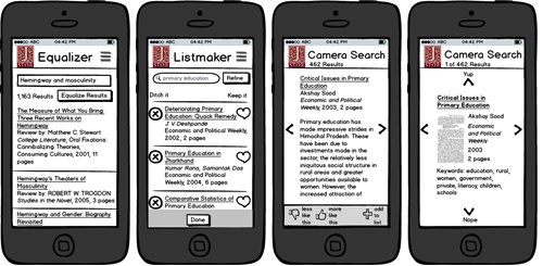
4 ways we tested to display search results on a small screen.
We showed all of these ideas to students and faculty and heard that, while they hated the way the list-view looked, that was the way it would have to be: one item per screen simply wouldn’t work for them. Then, an interesting thing happened that highlights the importance of not only listening to what users want, but also searching for the reasons why they want what they want.
We asked why the results needed to be shown together and not one at a time, and that uncovered a hidden step in their workflow. When they search for articles, they scan through the list twice, each time seeking to answer a different question. First, they scan over the whole list to answer the question: "Are my search parameters getting me what I want?" Then, once they’ve assessed that their search is on the right track, they go item-by-item within the results answering for each the question, “Is this specific result worthy of further investigation?”
This led us to ask: What if we showed a results summary to answer that first question before showing any actual results? If it worked, we could use the single-item view and users wouldn"t have to swipe through individual list items before finding out these weren’t even the results they wanted to see. We came up with the sketch shown on the right.
It was a great compromise and users were pleased with it. There was sufficient screen real estate to show all the desired article information without requiring extra swiping between articles just to see if they had used the right search.
With the right questions and insights, it"s possible to meet user needs better than the best solution they could envision themselves.
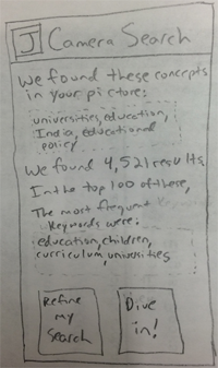
Sketch of a search results summary screen.
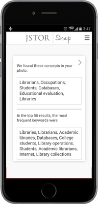
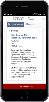
Final designs for summary screen and an article.